The company says it has joined financial aid to Ukraine suffering from Russian intrusions.
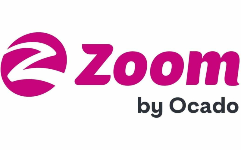
Ocado is reworking a new logo for its fast Zoom service less than a week after its launch. All because of the comparison of the logo with the Russian combat symbol Z, used on tanks and other military equipment of the Russian Federation in Ukraine.
The Guardian writes about this.
Last Friday, March 18, the online grocery store unveiled a logo with a white letter Z in the shape of a lightning bolt against a pink circle. However, on Thursday, the company said it was rethinking the logo after its design was quickly compared to a zwastika.
Twitter users tagged the logo next to the Ukrainian flag and wrote: “What a time to launch a rebrand with using a white “Z”. Another user pointed out that this is “not the best time for Z brands”.
“In light of the current circumstances, we are making minor changes to the icon ahead of our future Zoom by Ocado rebrand“, the company said.
“Our thoughts are with the Ukrainian people and all those affected by Russia's invasion of their country.The human tragedy unfolding in Ukraine and the refugee crisis on its borders shocked the world,” the company added.
It also said the organization had contributed £150,000 to DEC's crisis appeal for Ukraine to help provide food, first aid, shelter, medicine, clothing and other assistance to those who need it most.
Recall that the French fashion house Louis Vuitton has released a new collection of jewelry in the form of letters ” Z” and “V”, which have become symbols of Russian aggression in Ukraine.
See also:
- Russian attack on Ukraine: how Putin's invasion began
- What every Ukrainian should know in a war: rules and advice

