Odnoklassniki presented an updated interface for mobile applications for iOS and Android. The app home page has become lighter, and a single content creation button gives you quick access to all formats, from photos and posts to Moments.
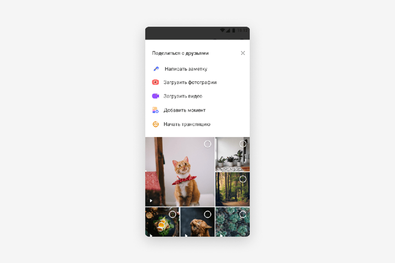
The application start page has become laconic: the news feed and the Moments service now occupy almost the entire screen, which allows you to focus on viewing content immediately after entering the application. The user's profile cover is now displayed only on his page, and the form for uploading content and creating publications has moved to a single section “Share with friends”, which is available by clicking the “plus” button at the top of the screen.

Now, with the help of one button, you can use several services at once: upload a photo or video, take a moment or write a post. The update is already available to some users of Android applications and will soon appear on iOS.
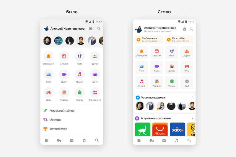
The changes also affected the application menu: it became more compact, and users got quick access to the most popular social network services. If necessary, you can expand the menu and see the full list of OK services.
Special widgets are located under the menu, with the help of which the user can quickly switch between recently visited pages, interesting groups or potential friends. Additional services in the form of mini-applications based on the VK Mini Apps platform are also available in the Android application through widgets. The new menu is already available to all users of OK applications.

Earlier in March 2021, the social network introduced major interface changes in the desktop version: the social network logo changed the font, and the color of the classic OK top menu was changed from orange to white.

