

The delta variant of the coronavirus is briskly striding across the planet. This strain is more aggressive than its “ancestor”, and penetrates human immunity much better. Literally all countries suffer from the delta option, no matter how many people they managed to vaccinate. But the difference in how the disease is carried in different parts of the world is huge.
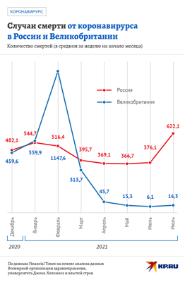
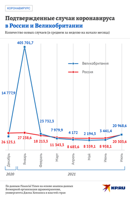
Here are two simple graphs showing why you need to get vaccinated at all.
On July 4, 24,700 new cases of covid infection were registered in Russia. On the same day, 24.2 thousand cases were counted in the UK – almost the same. That is, we can compare the situation in these countries: we are sick, and in England they are sick. Only British Prime Minister Boris Johnson for some reason removes almost all covid restrictions and even masks, with which everyone seems to have become akin, will soon become optional in Foggy Albion.
The thing is that there are now 116 injected doses of the coronavirus vaccine per 100 residents of the UK, that is, many were completely vaccinated (two injections for each). And in Russia this figure only recently exceeded 30 doses per 100 people. In other words, the British are vaccinated without fear or reproach.
Let's go back to our graphs. The second shows the number of deaths from covid in our country and in the UK. On the same day, when approximately the same number of people became infected, in Russia the virus claimed 650 lives, and in England – 15. Very eloquent circus.
That is, even if a vaccinated person picks up a new delta variant of covid, he will tolerate it more easily than an unvaccinated one.